Quarter Circle
Simple shapes, when deconstructed, can create surprising effects. Here, the simplest shape of all, the circle, is separated into four quarters. The choice of glaze colour (or no glaze) determines the contrast between shape and background and the quarters can be brought back together to be whole again or be left incomplete. The rhythm of a pattern can be disrupted by one break in the sequence.
Contact us for a quote based on your required quantity. We recommend ordering a sample kit to see our tiles in real before placing an order.
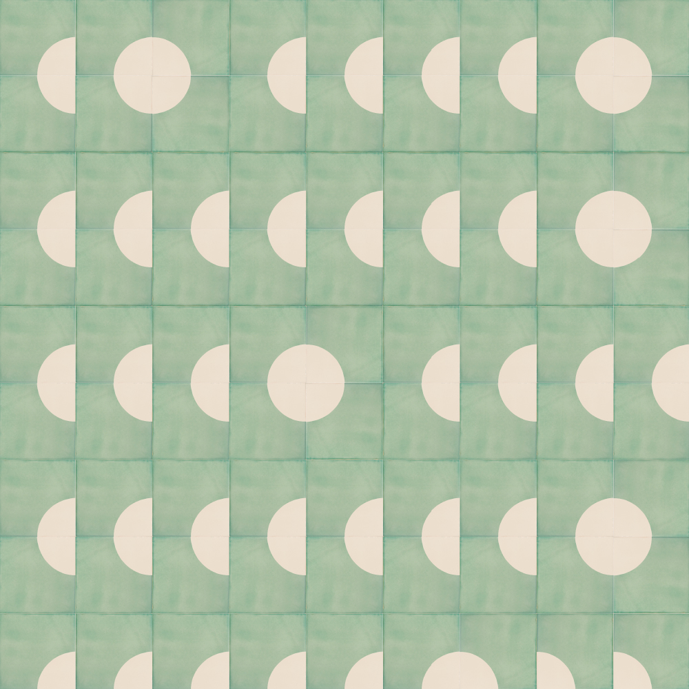
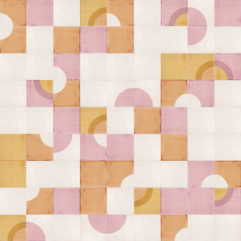
Designs with Quarter Circle tiles
Round windows, tall buildings uses the QC1 tile from our Quarter Circle range in a sort of semi-regular, semi-irregular pattern to hint at lines of windows in a tall building.
As with all our designs, you can choose to mix in tiles from other ranges, such are the Sunrise SR2 tile. This design, called No fly-posting, does just that, adding in ALL1 all-over printed tiles for good measure. The somewhat chaotic combination of tiles with the hint of order suggests peeling posters on an urban wall.
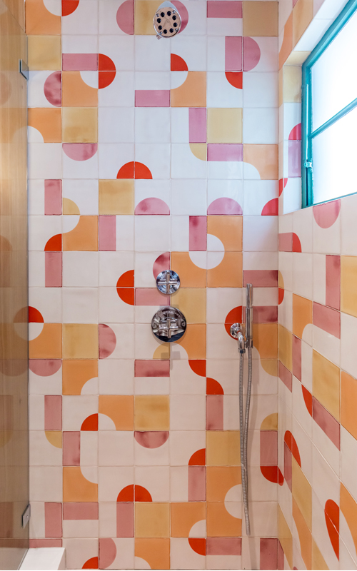
Installations using Quarter circle tiles
Bestor Architecture of California designed this brightly playful bathroom with a range of pink, orange, red and yellow colours that perfectly off-set the baby blue window.
Photo by Linda Kasian.
Bar Harta in New York’s Grayson Hotel has over 900 sq. ft. of double screen-printed Smink Studio Quarter Circle tiles.
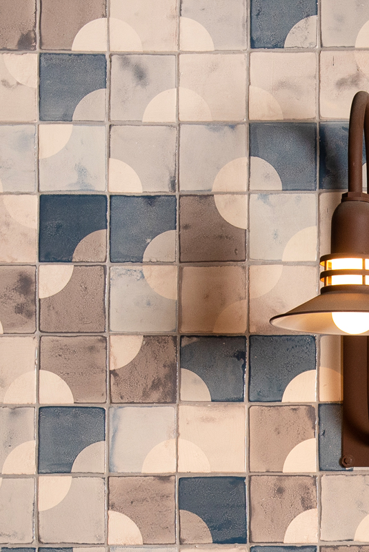
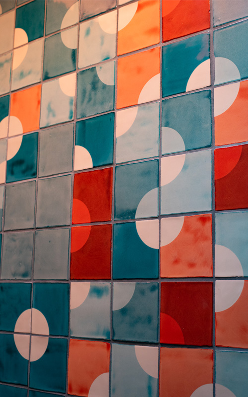
The White Building in Santa Fe is actually intensely colourful. The space is used as an arts centre as well as the headquarters of a data analytics firm. The rich colours of our single and double-printed Quarter circle tiles stand out within this architectural gem.
Collection
Select the tiles you wish to order.
Product information
- Each tile measures 14 x 14 cm / 5.5 x 5.5″ (sizes can vary slightly as the tiles are handmade)
- Handmade and screen printed, 100% waterproof glazing
- Suitable for all areas including kitchen, bathroom, shower, swimming pool and outdoors
- Minimum order quantity: 3m2 / 33sf (50 tiles)
- Lead time: 4-6 weeks plus transport time
Available colours
Select the colors you wish to mix and match.